Instrumentation is invaluable | Metrics and APM can change how you develop and ship software
December 20, 2019
This post is an introduction to instrumenting your software. I’ve found it to be a game-changer in my daily work, I want more people to join in on the party and speak the metrics language.
Instrumentation refers to an ability to monitor or measure the level of a product’s performance, to diagnose errors and to write trace information - Wikipedia
Writing software with best programming practices and tests is great, but observability and metrics around its runtime behavior can build confidence on another level. We’ll walk-through some instrumentation scenarios in the context of a python backend application using Datadog. We’ll see how easy it is to derive valuable insights with little effort. Towards the end, I’ll describe how it’s been a game-changer for me.
Note: I’ve personally fallen in love with Datadog, but you may use other tools like StatsD, Prometheus, Grafana, etc. I will not go over setting up Datadog either. My goal here is to highlight the usefulness and to cultivate a measurement instinct 📊, the implementation details can be different.
Let us start!
In this section, we’ll discuss capturing and visualizing metrics using examples. There are numerous metric types and operations available in Datadog, we’ll play with Counters, Timers, and Gauges.
Counters
Count how many times a thing happens in an interval - eg. Page-views, cache hits/misses, that specific payment gateway exception, etc.
Let’s say we’re tasked with reducing the load from some read-heavy requests. We can tolerate some staleness so we wrote a shiny read-through-cache with Redis:
# trips_cache.py...def get_trips(self, trip_ids) -> Set[Trip]:trips_from_cache = self._get_from_cache(trip_ids)cache_miss_trip_ids = {id for id in trip_ids if trips_from_cache.get(id) is None}if not cache_miss_trip_ids:return trips_from_cachetrips_from_store = self._trip_service.get_trips(cache_miss_trip_ids)self._cache_multi(trips_from_store)return trips_from_cache + trips_from_store...
We’ve written tests, and we have that LGTM in pr-review! But ask yourself, do you feel confident about deploying this to production? Say we deployed it, now - Does it work as expected? How effective is it? Truth is, we don’t have visibility, let’s fix that:
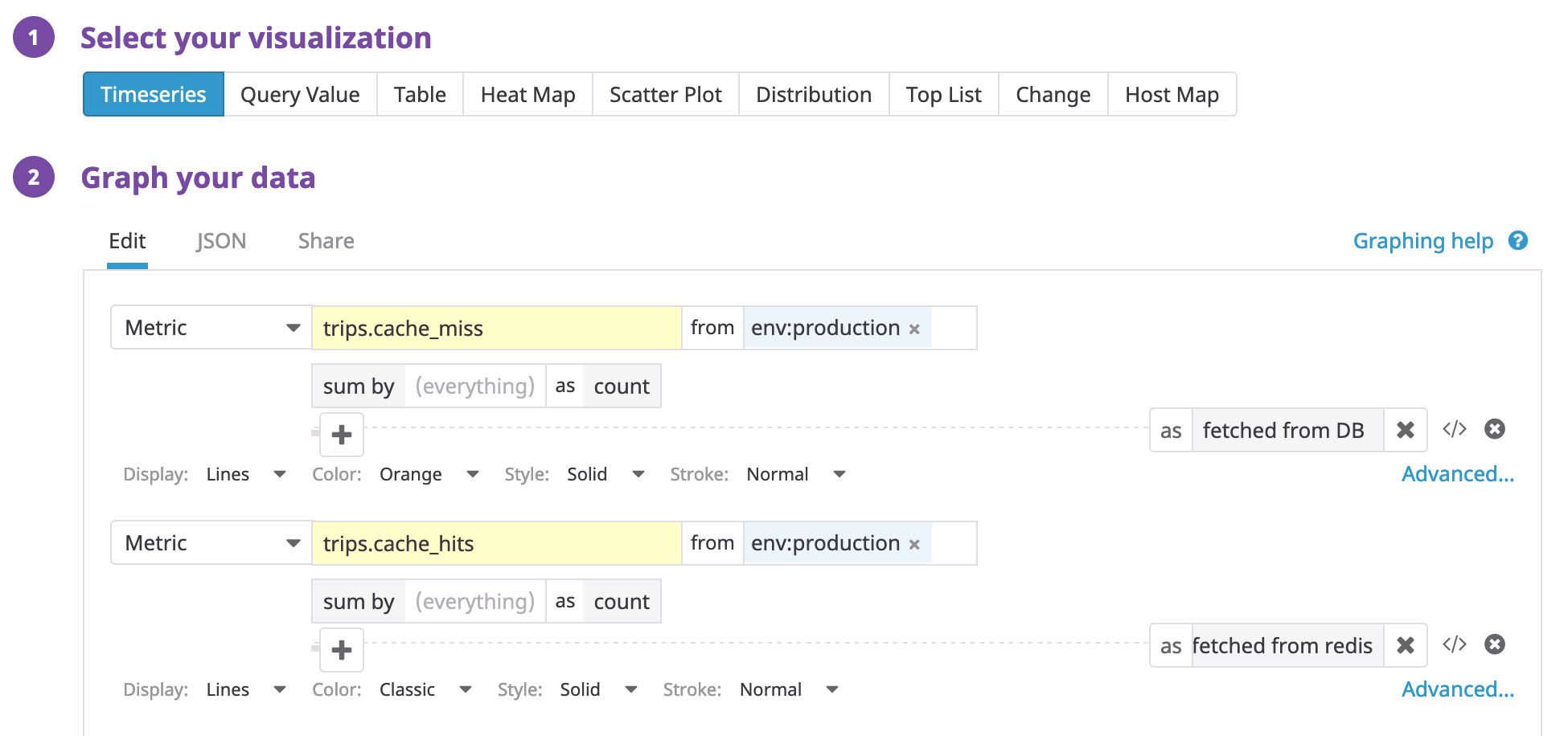
# trips_cache.pyfrom datadog import statsd...def get_trips(self, trip_ids) -> Set[Trip]:trips_from_cache = self._get_from_cache(trip_ids)statsd.increment("trips.cache_hit", value=len(trips_from_cache))cache_miss_trip_ids = {id for id in trip_ids if trips_from_cache.get(id) is None}if not cache_miss_trip_ids:return trips_from_cachetrips_from_store = self._trip_service.get_trips(cache_miss_trip_ids)statsd.increment("trips.cache_miss", value=len(trips_from_store))self._cache_multi(trips_from_store)return trips_from_cache + trips_from_store...
And that’s it! Now we are ready to deploy. Every time this method runs, it’ll report stats to Datadog (through DD-Agent). Great, now that we’re collecting metrics, let’s visualize them. Head over to your Datadog dashboard and plot a time-series of cache-hits and misses.
We selected time-series, the metrics to plot, and some visual styles to go along. Cache hits are shown in purple and cache-misses in orange (it’s the flat line at the very bottom).
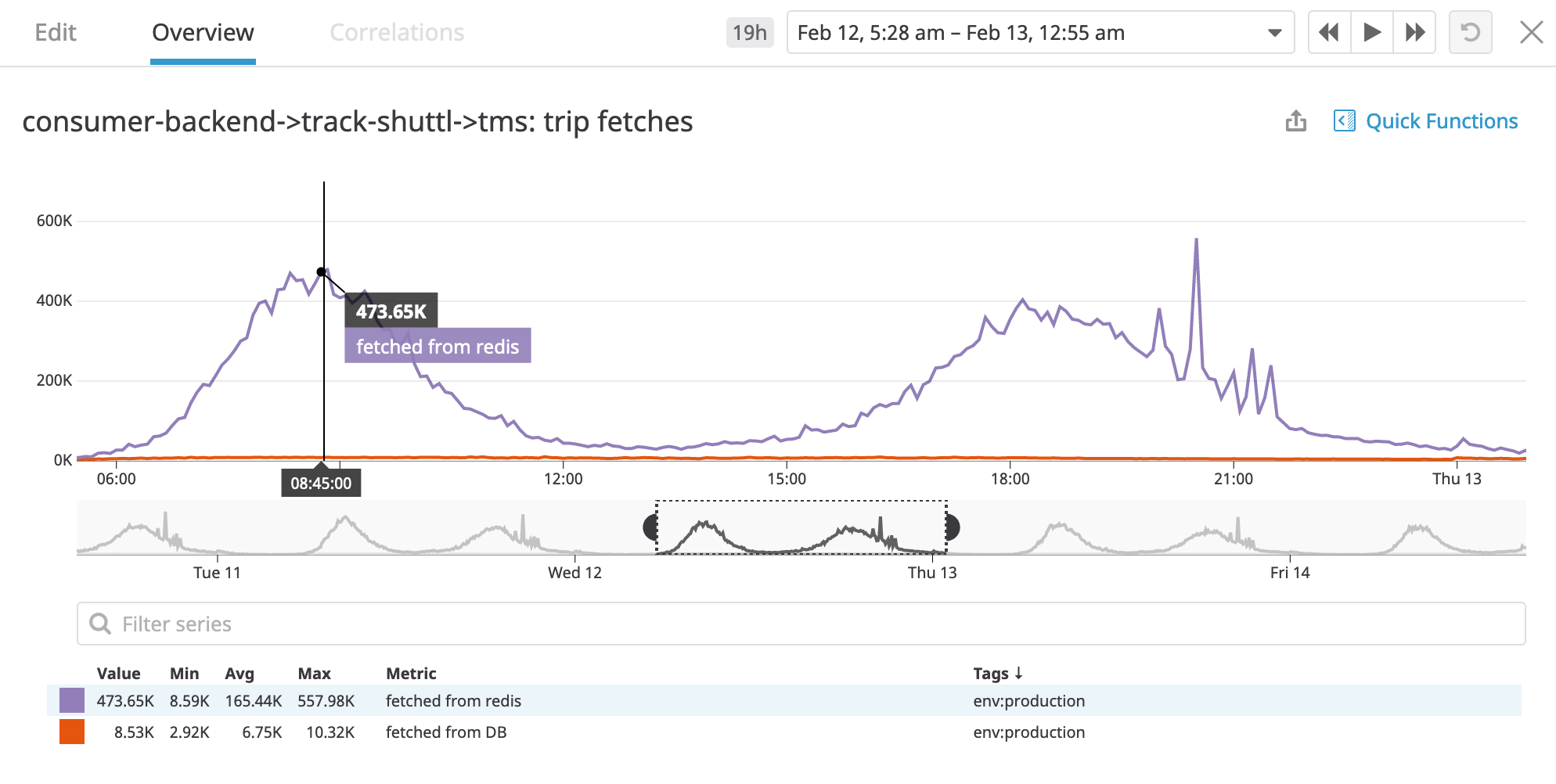
Wow! our cache works, look at those cache hits! and we can see new stats coming near-realtime! How cool is that?
Now we can confidently answer the questions - yes our cache works, we saved these many calls to our database. We notice the pattern of cache hits/misses coincides with peak load timings on our system as expected. We can even tweak our cache expiry-time and be able to tell the difference!
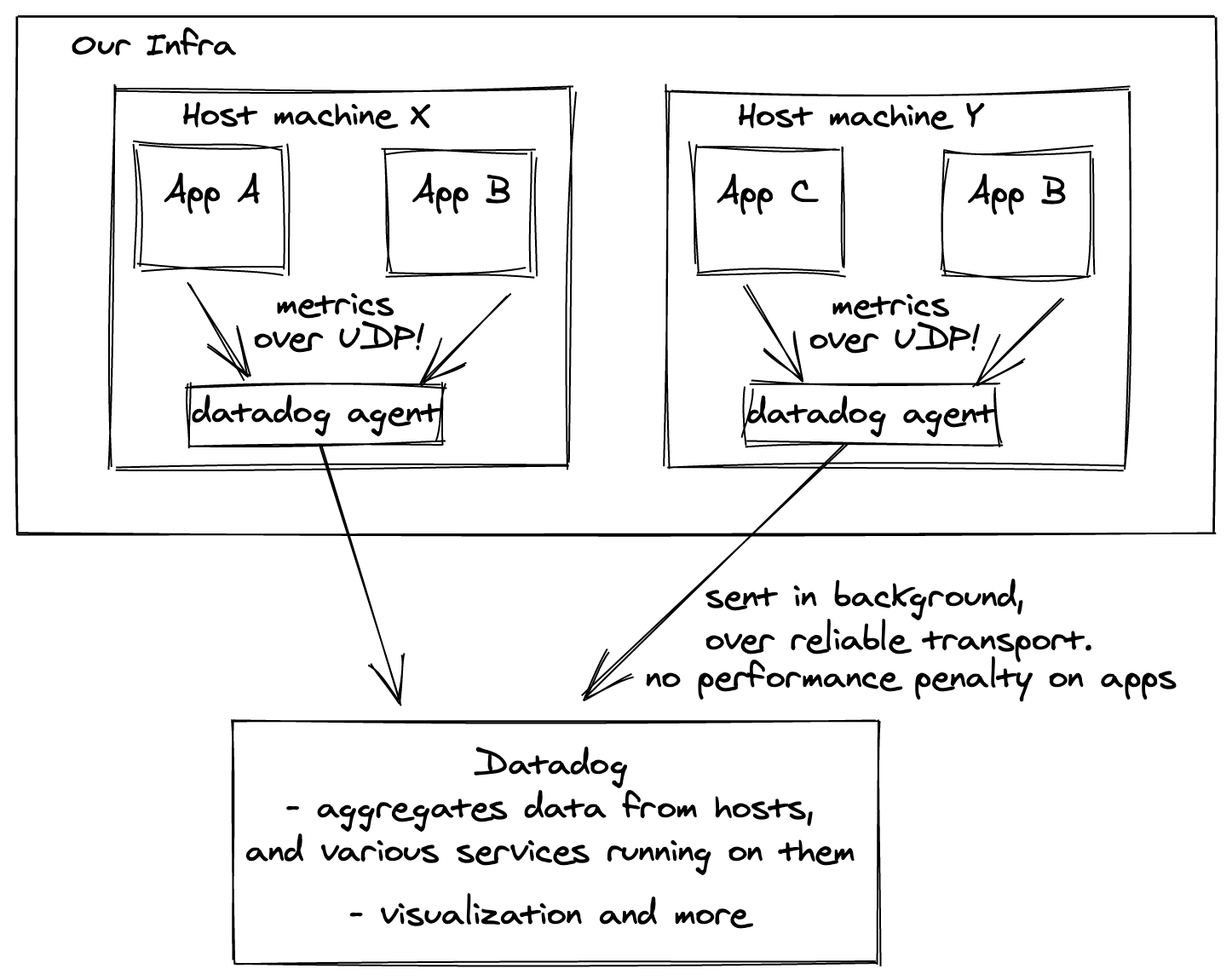
With a few lines of code, we have near-realtime visibility on the behaviour
of our system. Note that, when we invoke statsd.increment it’s not making a network
call to Datadog; if we collected stats like that there would be a HUGE performance penalty. Instead, it sends data over UDP to datadog-agent
on your host machine (fast!), which will then push these metrics to Datadog’s servers.
This is different from pull-based designs like Prometheus.
Timers
Let’s say we’re tasked with improving the time taken by an async job. Before we’d jump into complexity analysis and napkin math, our instinct should be to measure the current situation, to establish grounds for comparison with any “improvement”.
from datadog import statsd...@statd.timed("async_job_time_taken")def my_async_job():slow_af_implementation()...
The decorator on our function will report the time taken by our async job to Datadog. Let’s plot it! We’ll again select time-series, to see how it varies over time.
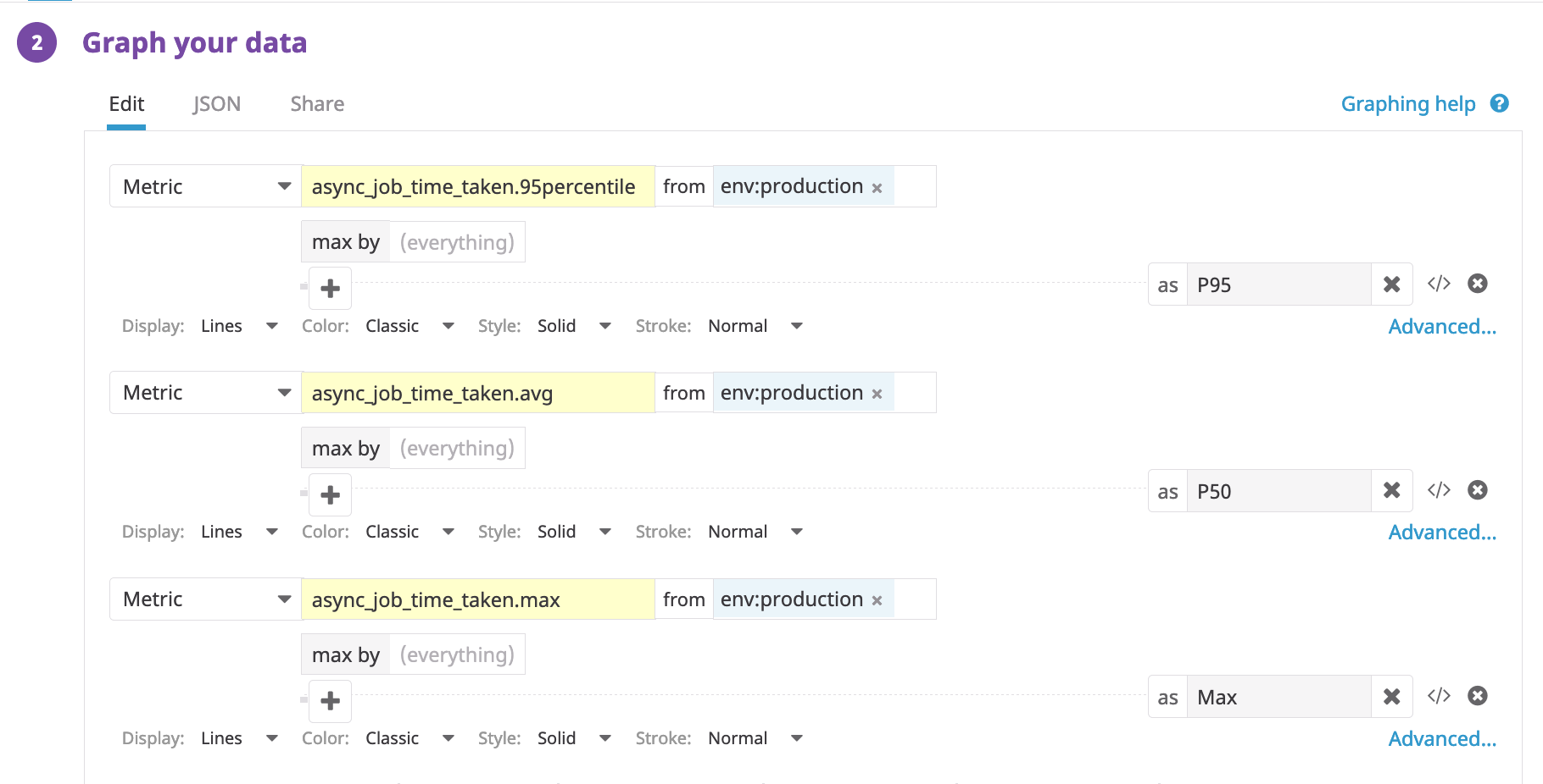
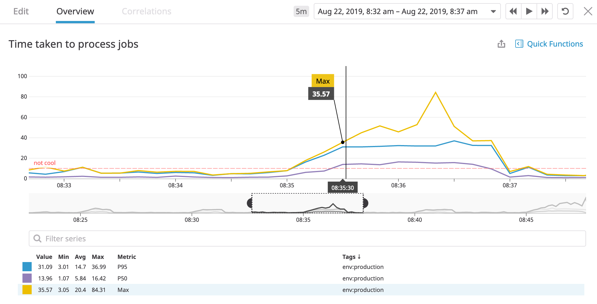
The y-axis shows the time taken in seconds. With timers, we get built-in stats like avg, max(yellow), and p95(blue), shown in different colors.
We also set a y-axis marker not-cool, to signify that values above this threshold are not ideal.
This is the metric to beat, metric-driven development!
 Great, now we can reason about the current performance. We come up with
a solution
Great, now we can reason about the current performance. We come up with
a solution fast-af-implementation, deploy it, and are now glued to the dashboard.
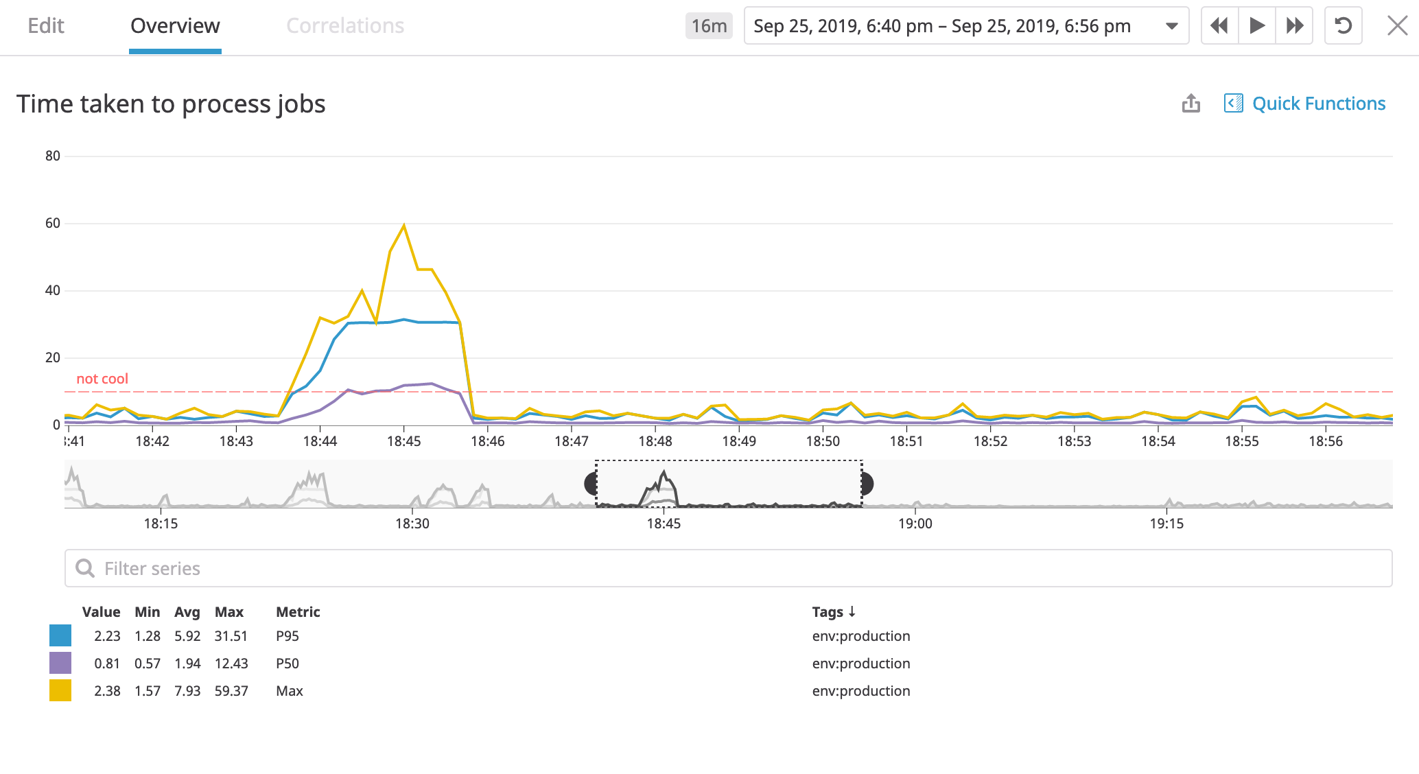 It worked! p95, avg, max, all start are well below the
 not-cool marker! pretty cool!
What’s amazing is that we saw that value dive as soon our code was deployed,
so satisfying, high-five!
Gauges
You know what, I’m going to leave this one as an exercise 🙂. Think of gauges like the speedometer in your car; now, get creative!
This is just scratching the surface.
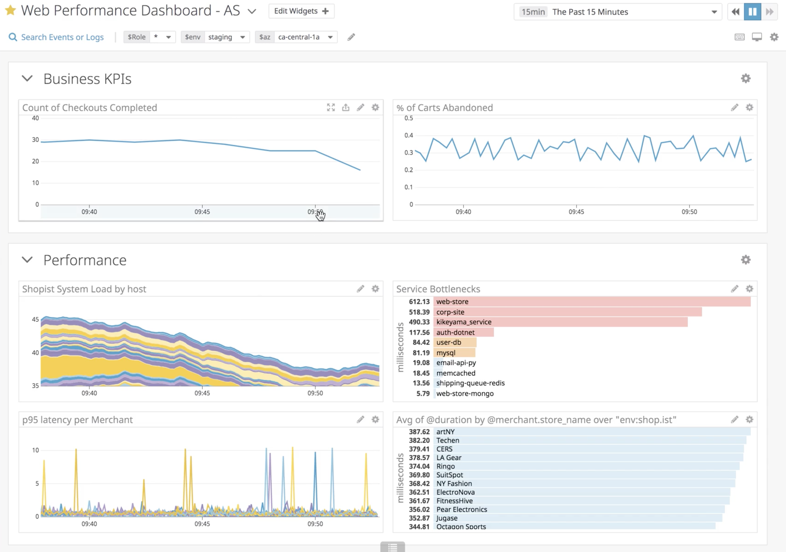
At Shuttl, we have many, diverse, dashboards - beautiful payment gateway stats showing state machines and failure reasons, ETL pipelines, Service health dashboards, and around even user-behavior like missing the bus. There are various metric types, and also, presentation formats apart from time-series.
Gain visibility in your infrastructure - There are numerous metric source integrations available: AWS, DB, Redis, Docker, APM, Job schedulers like Nomad, and more. “How many containers for this service are running in prod?” - Just a query away.
You can give custom tags to metrics as well, It’s a playground for the data-driven. Here’s a dashboard of a fairly complex async job that calculates all trip’s ETAs at Shuttl, it’s a time-board so that we can correlate various aspects of the system at a particular time as our mouse pointer hovers over them.
From this dashboard, you can answer questions like - active trips at a time, jobs processed per second, the oldest message age in SQS, the lambda execution time for a GPS query, and many more. This particular snapshot is from a production issue we had, notice that many graphs go hay-wire and spiky. In this case, our GPS-query time shot up, which led to more time in processing jobs, job-failures, and so on. Once it recovered, the job processed per minute shot up to process pending tasks; It’s that easy to explain systems behaviour with instrumentation in place.
Why I think it’s a game-changer
If you’re not sold yet on the multi-bagger gains, here are some less apparent things you’ll notice over time.
You become proactive: You can ascertain boundaries in system behavior that must hold for the proper functioning of a feature or workflow. No, I’m not talking about correctness that can be ensured with unit tests; Think throughput, events, latencies, thresholds, etc. What’s great is you can turn these boundaries or runtime assertions into Monitors and Alerts! alerts notify you when things go off, not your customers. Metrics also expose issues early on.
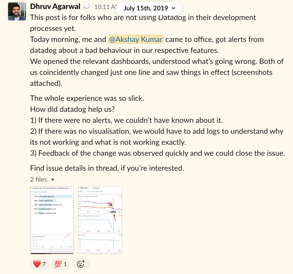
Cultural shift: Metrics are objective, not subjective. They’ll raise the quality of discussions between peers. Issues are a breeze to diagnose. The phrase “root-cause-analysis” will be heard less often when you can open a dashboard to answer critical questions in seconds. Here’s an anecdote from Shuttls engineering-slack channel, starring me and my colleague Dhruv:
The added layer of confidence: It feels like you have your own Nasa Mission Control, without it, I feel like I’m flying blind.
That’s it for this introductory post
I hope I sparked some interest in you.
- If your org doesn’t do instrumentation maybe push for it.
- If org has some form of instrumentation, and you’re a beginner, then explore some existing dashboards, make a clone and play around. Start with counters, then some tags. Doesn’t matter if it seems like a useless metric to track. It’ll start to click.
- If you can already speak the metrics language, teach others, maybe suggest a metric in PR reviews and help them plot it.
Cultivate a measurement instinct; derive insights and actionable from anything that moves and ship software like a warlord ⚔️.
Written by Akshay Kumar who likes to engineer delightful products, and share cool stuff. Sometimes posts on Twitter